

As a proofreader, I see a lot of Word documents, and some of them are messy to say the least. But I’ll let you in on a secret: it only takes a few simple tricks to make any document look a thousand times better.
A messy document is confusing to look at and difficult to read. It might use a mixture of different styles, fonts and colours; there might be overcrowded lines or large gaps; the text might be too small or too large; and it might be unclear which parts should be read in which order. Take a look at this example to see what I mean:

Of course, if you’re writing something – be it an article, a blog post or a book – you’re going to spend most of your time crafting the words, and then send it to a proofreader for a final polish. But there are a few simple things you can do to make any document look instantly better, without making any changes to the text itself.
Here are 3 ways to take your document from messy draft to polished piece.
1. Fonts are fun – but let’s just use one!
In general, you should use just one font in one colour for a piece of writing. I know, I know, it’s hard to resist the allure of a sidenote in cyan Segoe or a heading in hot pink Harlow, but we’re going for readability above all, and using lots of different fonts and colours is distracting.
If you want to distinguish between different types/sections of text in your document, you can do so much with the magic of formatting. Who needs multiple fonts when you can use bold, italics and different font sizes?*
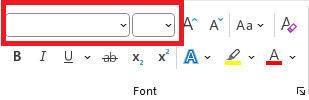
Select all the text in your Word document (Ctrl + A) and look at the font menu in the top left of the Home section. If the font box is blank, you’ve got multiple fonts in your document – choose the most appropriate one to make all the text the same. Et voilà, your document already looks tidier!
2. How you style your headings matters
Chances are, you’re going to have headings in your document – these are used in everything from articles to blog posts to reports to books, to break up long sections of text and make it more readable.
When putting in your headings, remember: style carries meaning. Bigger, bolder text comes across as more important than smaller text. Text styled in different ways will look like separate sections, rather than parts of a whole. It’s no use having the heading ‘Section 1’ in big bold text and ‘Section 2’ in small italic text if they’re meant to be of equal importance. If they look different, readers will assume they are different.
So, in order to be useful, your headings need a system – and you need to be consistent with it. For example:
1. The main heading of a section of your document
1.1 A subheading under the main heading
1.1.1 A sub-subheading under the subheading
You can immediately give your document a clear structure and logical flow if you pay attention to your heading styles. It really is that simple!
3. Tidy up the spacing
One of the most easily overlooked elements of a Word document is line spacing, especially when you’ve copy-pasted pre-formatted text from elsewhere and ended up with a load of styles that look subtly – but irritatingly – different.
Never fear! Once again, Ctrl + A is our friend: you can select all the text at once, go to Home > Paragraph > Indents and Spacing, and select one consistent line spacing rule for the whole document.
Don’t forget to also adjust the Before/After spacing and tick or untick the ‘Don’t add space between paragraphs of the same style’ button, because inconsistencies in these can still make a mess of your work.

Go forth and tidy
So there you have it: 3 quick and easy ways to tidy up any Word document and make it clear and comfortable for your reader. You’d be surprised how much formatting I do when I proofread – and what a big difference these seemingly tiny changes can make.
Remember that example from earlier? Here it is again, but tidy:

To be clear, I’m not advocating for making every Word document plain and orderly – sometimes you may want to create something colourful and filled with funky fonts. But most of the writing we do has a particular purpose, and the formatting of your document needs to serve this purpose, rather than get in the way. So before you find yourself reaching for the rainbow colours and the fancy fonts, ask yourself: does it serve the purpose of your writing, or is it just distracting from your words?
And if you would like a professional to tidy up your work, you can hire me as a proofreader or copyeditor. Please contact me and send your messy documents my way!
*Sidenote: We’re talking about Word documents here. If you’re getting into more intricate layouts (e.g. a book with images, diagrams, inset textboxes), you may want to use multiple fonts and colours – and in that case you’re going to need a designer and a program other than Word!
